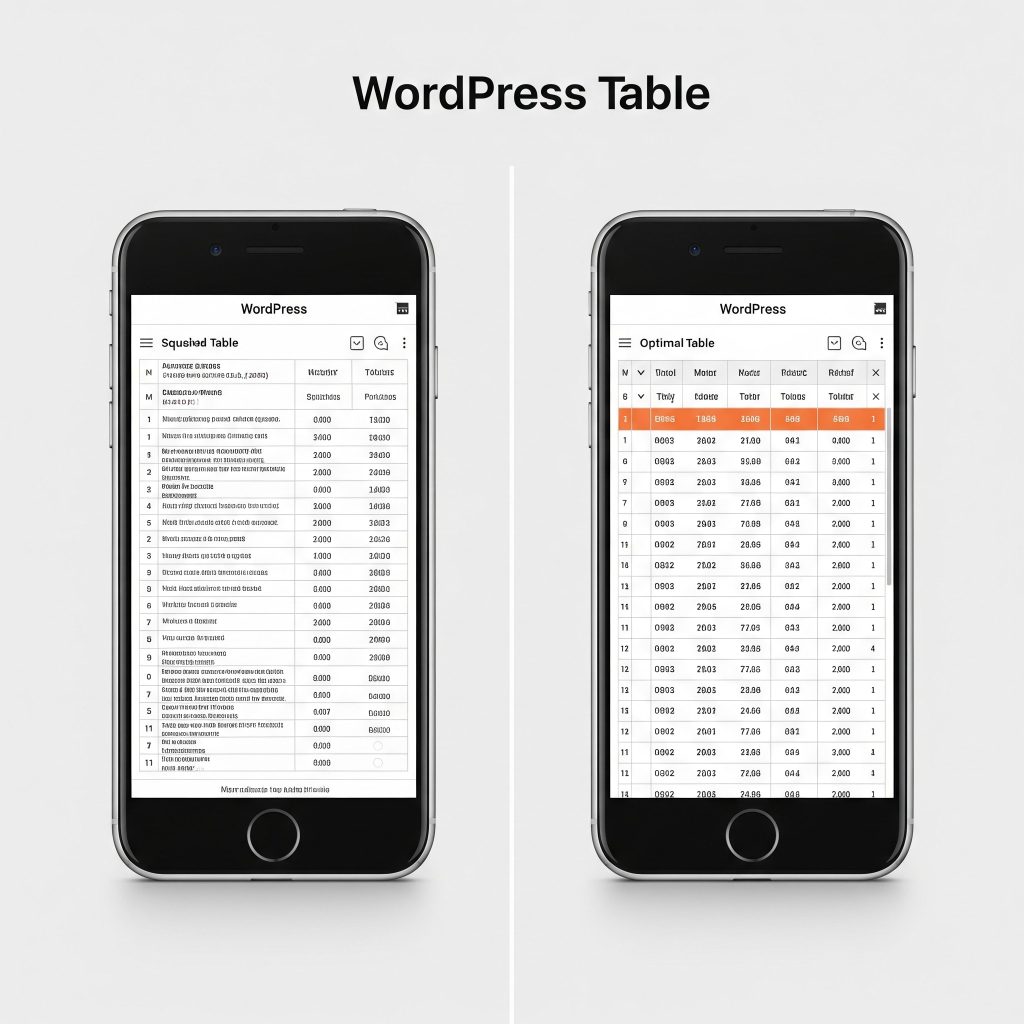
Are your beautifully organized WordPress tables turning into unreadable messes on mobile phones? You’re not alone! Many WordPress users face the frustrating challenge of tables that try too hard to be “responsive” by compacting themselves into an unreadable squish.
The good news? You can easily make your tables horizontally scrollable, ensuring your data remains perfectly legible, no matter the screen size. Let’s dive into how to achieve this with some simple, yet powerful, CSS.
The Problem: Tables That Get Too “Responsive”
Modern WordPress themes are designed to be responsive, meaning they adapt to different screen sizes. While this is great for most content, tables often suffer. Instead of shrinking gracefully, they might:
- Wrap text aggressively: Your cell content wraps onto multiple lines, making rows very tall and hard to follow.
- Shrink columns: Columns become so narrow that content is cut off or overlaps.
- Become unreadable: The overall layout breaks, making it impossible for users to extract information.
The solution isn’t to force the table to shrink, but to allow it to scroll horizontally when it’s wider than the screen.
The Solution: Embracing Horizontal Scroll for Tables
The magic behind scrollable tables lies in a simple CSS property: overflow-x: auto;. When applied to a container element, this property tells the browser: “If the content inside me is wider than I am, add a horizontal scrollbar so users can see everything.”
In WordPress, especially if you’re using the Block Editor, your tables are often wrapped within a <figure class="wp-block-table"> element. This is our perfect target!
Step-by-Step Guide: Making Your Tables Scrollable
Here’s exactly how to implement the necessary CSS:
1. Access Your WordPress Customizer
- Log in to your WordPress dashboard.
- Navigate to Appearance > Customize.
2. Open “Additional CSS”
- In the Customizer sidebar, scroll down and click on Additional CSS. This is where you can add custom CSS rules without directly editing your theme files (which is safer and update-proof).
3. Add the Custom CSS Code
Paste the following CSS code into the “Additional CSS” box:
CSS
.wp-block-table {
    overflow-x: auto;
    -webkit-overflow-scrolling: touch; /* Improves scrolling on touch devices */
}

/* Optional: Prevent text from wrapping inside cells, forcing wider tables */
.wp-block-table table.has-fixed-layout {
    white-space: nowrap; /* Keep cell content on a single line */
    width: auto; /* Allow the table to expand beyond 100% */
    min-width: 100%; /* Ensure it still fills the container when content isn't wide */
}
4. Publish Your Changes
- Once you’ve pasted the code, click the Publish button at the top of the Customizer.
Understanding the CSS
Let’s break down what each part of the CSS does:
.wp-block-table: This targets the main container element that WordPress wraps around your tables. Applyingoverflow-x: auto;here is crucial.overflow-x: auto;: This is the core property. It enables the horizontal scrollbar when the table content exceeds the container’s width.-webkit-overflow-scrolling: touch;: This enhances the scrolling experience specifically for touch-enabled devices (like iPhones and iPads), making it feel more native and smooth.
.wp-block-table table.has-fixed-layout: This targets the actual<table>element inside the.wp-block-tablecontainer.white-space: nowrap;: This is an optional but highly recommended property if you want to prevent text from wrapping within your table cells. By forcing the text to stay on one line, you’re explicitly telling the browser that the table needs to be wider, which in turn triggers the horizontal scroll on the parent container. If you want text to wrap in cells but still have the table scroll if there are too many columns, you can omit this line.width: auto;andmin-width: 100%;: Whenwhite-space: nowrap;is used, these properties help ensure the table can expand beyond its default 100% width to accommodate the now-wrapping content, while still taking up at least 100% of the available space when content isn’t very wide.
Why This is Great for SEO and User Experience
- Improved Readability: Users can easily access all your table data without squinting or frustration.
- Lower Bounce Rate: A better user experience means visitors are more likely to stay on your page longer.
- Mobile-Friendly: Search engines like Google prioritize mobile-friendly websites. Scrollable tables contribute positively to your site’s overall mobile usability score.
- Clearer Data Presentation: Your structured data (tables) remains intact and comprehensible, which is valuable for users seeking specific information.
Test, Test, Test!
After adding the CSS, it’s crucial to test your blog posts on various devices:
- Desktop: Ensure the table still looks good.
- Tablet: Check both portrait and landscape orientations.
- Mobile Phone: Test on different phone models if possible.
Look for the horizontal scrollbar at the bottom of your tables and ensure you can smoothly scroll to see all the content.
Say Goodbye to Squished Tables!
With this simple CSS snippet, you can transform your cramped WordPress tables into user-friendly, horizontally scrollable data displays. Your readers (and search engines!) will thank you for the improved experience.
Give it a try and let us know how it works for your blog in the comments below!